Affinity Maps versus Card Sorting: What the Difference is and How to Use Them
Affinity mapping is used in UX research to get an understanding of how people organize their thoughts about different topics whereas card sorting helps them learn about the structure of user mental models based on where they would categorize various pieces of content like ideas from interviews or survey feedback.
Wes Hunt

You may have heard of affinity mapping and card sorting before, but do you know the difference between these two UX methods? Affinity mapping is a method that helps UX designers find out how people think about their thoughts on a certain topic. Card sorting is also used by UX designers to learn more about how users think about topics. Today we are going to discuss what affinity maps are and how they work, as well as what card sorts are and when to use them. We will finish by comparing the differences between both types of techniques, including when it's appropriate to use each one in your research process.
Affinity Maps
An affinity map is a diagram that shows how people think about their thoughts on a certain topic. It can be used to help identify any commonalities or patterns among related ideas. Affinity maps are often created during the early stages of user research when UX designers are trying to get an understanding of how users think about specific topics.
Affinity maps are created by first putting all of the ideas or thoughts that you want to study into one big pile. Then, you start grouping related ideas together and create a diagram that shows how these groups are related. Affinity maps can be filled with lots of different types of information, such as user feedback, data gathered from interviews or surveys, or even just simple hand-drawn sketches.
Card Sorting
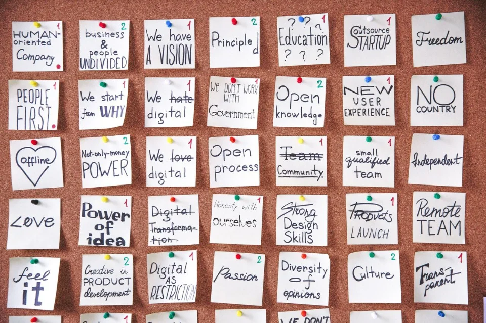
Card sorting is a technique that helps UX designers understand how people organize their thoughts and ideas about different topics. It can be used to learn about the structure of your users’ mental models, which are often made up of categories and subcategories for larger concepts. This information comes from asking questions such as "In what category does this idea belong?" or "What other ideas do you think should go in this group?". In card sorts, these cards with the various user responses on them would then end up organized into groups based on how they were sorted by participants. Like affinity mapping, card sort techniques also involve creating diagrams that show relationships between all types of content including written user feedback, sketches, and notes.
Card Sorting vs Affinity Mapping: What's the Difference?
So what is the real difference between affinity mapping and card sorting in terms of how it can be used for UX research? Well, there are a few things that make each technique stand out from one another. First off, affinity maps help you understand how people organize their thoughts about something while card sorts help you to better understand how users might categorize different information. Next, affinity map diagrams show relationships among ideas whereas card sort diagrams show relationships among cards or pieces of content like user feedback or survey results. Finally, with an affinity map diagram participants do not need to share any specific knowledge but rather just describe existing mental models; on the other hand, card sort participants must know specific information to classify the cards. Affinity maps tend to be more open-ended and provide a deeper understanding of how users think while card sorts are more structured and can help UX designers better understand what content might go together on a certain page or feature.
In both types of techniques, you end up with diagrams that show relationships between all kinds of data including written responses, sketches, and notes; however, affinity maps tend to be more free-flowing and less structured than card sorts. Card sorting is better for understanding how users would categorize information while affinity maps are better for understanding how people think about things. Affinity mapping can be used in combination with card sorting to get a more complete understanding of user mental models. When deciding which technique to use, it is important to consider what you want to learn from your research participants.
Summary
In conclusion, affinity mapping is used in UX research to get an understanding of how people organize their thoughts about different topics whereas card sorting helps them learn about the structure of user mental models based on where they would categorize various pieces of content like ideas from interviews or survey feedback.

