An Affinity Diagram: Strengths, Weaknesses, and Steps to Creating
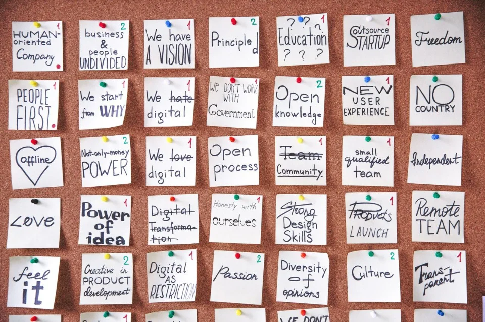
Affinity diagrams are a great way for UX designers to organize and group user ideas or research findings. They help with getting a big-picture view of designs, and can also help with seeing redundancies or areas for improvement.
Wes Hunt

An affinity diagram or affinity map is a powerful tool for any UX designer. It can help you identify product features, understand the needs of your target audience, and gain insights about what might not be working in your design. This blog post will go over how to create an affinity diagram and the strengths and weaknesses of this method so that you can decide whether or not it's right for your project!
What are Affinity Diagrams (KJ Method)?
Simply, affinity diagrams organize a large number of ideas and information into related groups with natural relationships. For UX, and especially user research, affinity diagrams are used to sort and group large amounts of qualitative research data into themes.
The affinity diagram was developed by Jiro Kawakita in the 1960s and is also referred to as the KJ Method.
Affinity diagrams are great tools for brainstorming new ideas because they give you a whole new perspective on how everything fits together in your design. They also provide insight into relationships between features so that designers don't get stuck designing around one idea only - after all, design is about the user experience! For UX designers and researchers the affinity diagram is useful for grouping and connecting large amounts of research input from interviews and surveys. Afterward, you will have groups of concepts and relationships based on how participants understand them.
When to Use Affinity Diagrams?
Affinity diagrams are best used in UX when there's a lot of research data to analyze, you need to see the big picture, or when you need to generate new ideas. They can help understand your target audience, identify product features, and gain insights about what might not be working in your user interfaces. However, affinity diagrams should not be used when you need to make decisions about what to design next - for that, you'll need to use a different tool like wireframes or prototypes. Anytime you have more information than you can handle in your mind and organize is a good candidate for affinity diagrams.
For UX, affinity diagrams are great for organizing data from:
- Contextual Inquiry: Your observations of people's activities and any resulting discussions with them can produce a lot of insights and feedback.
- Open-Ended Survey Questions: Open-ended questions produce very valuable insights, but also a significant amount of data. Imagine having just 2 open questions on a survey for only 200 participants, you could get 400 comments to try and make sense of!
- Any Qualitative Data: Besides contextual or survey techniques, anything that produces a lot of qual data. Logs from customer service, usability tests, exploratory interviews, market research, competitor reviews all produce lots of qual data.
- Customer Brainstorming Sessions: More freeform than card sorting, you can run brainstorming and affinity sessions with customers to understand their mental models and priorities.
- Team Brainstorming Sessions: This is a common use case of the KJ Method, but since the UX team should be involved in the product design and problem-solving process they must be helping brainstorm solutions.
Strengths of Affinity Diagrams for UX Designers
Affinity diagrams are great tools because they give you a new perspective on the user experience. It's easy to get stuck designing around one or two ideas, but an affinity diagram helps product managers and designers gain insights by looking at many different perspectives simultaneously!
Highlight Relationships
Affinity diagrams also help you see relationships between ideas. This can be helpful when designing a feature or website because it gives you a big-picture view of how everything works together. You might find that some ideas are redundant or that there are areas for improvement once you see them all grouped.
Discovery and Brainstorming
Affinity diagrams are great for brainstorming new ideas because they give you a whole new perspective on how everything fits together in your design. They also provide insight into relationships between features so that designers don't get stuck designing around one idea only - after all, design is about the user experience! Affinity diagrams can be time-consuming when trying to sort through many different ideas at once, but it's important not to rush this step of the process. If done correctly an affinity diagram will help with getting big picture insights and seeing redundancies or areas for improvement within your designs.
Organize and Synthesize Qualitative Research
The most powerful strength of affinity diagrams for UX is organizing qualitative data. By having a team help group and surface relationships in qual data, you can prevent your own biases that may influence what insights surface from research. Imagine pouring through hundreds of survey responses by yourself. Most people will only be able to fixate on the most emotional responses or the most recent (recency bias). By involving other perspectives in organizing the research, you will decrease how much your individual biases affect the insights that are surfaced.
Affinity map sessions can help teams organize and synthesize large amounts of information, such as ideas generated during a brainstorming session or customer feedback. By grouping similar ideas together, teams can identify key themes and patterns that can inform the design process.
Surface Key Priorities
Affinity map sessions can help UX and product teams identify the most important ideas and priorities to focus on, by organizing ideas according to importance or priority. This is especially true when the mapping session includes stakeholders from other teams like management, customer experience, or sales.
Promote a User-centered Design Process
User-centered design should always be the focus of a UX team, Affinity map sessions can help teams focus on the needs and preferences of users, by organizing ideas according to how they relate to user goals and behaviors. This can be increasingly powerful for the organization when other teams are part of the process or get to review the results of the mapping process.
Identify Potential Design Solutions
When combining brainstorming with the results of research Affinity map sessions can help teams generate and evaluate potential design solutions, by organizing ideas according to how they might address user needs and goals.
Weaknesses for UX Designers
There are a few situations when UX designers may not want to use affinity map sessions, or where they may need to be cautious about the limitations of this tool:
Affinity Diagrams Are Time-Consuming
Affinity diagrams can be time-consuming, especially when you're first starting out. It's important to take your time so that you don't miss any important ideas, but it can be difficult to do this when other tasks are waiting for your attention or if there are other time constraints. Affinity map sessions can be time-consuming, especially if the team is working with a large amount of information. If time is limited, other methods, such as user journey maps or service blueprints, may be more efficient.
Hard to Preserve the Results
Another downside to affinity diagrams is that they can be messy! Once all of your sticky notes are grouped into categories, it can be difficult to see the big picture. This is where a whiteboard or large sheet of paper can come in handy. You can also use different colors or symbols to help you group ideas together.
Digital whiteboard or card sort tools will help with this and enable keeping the resulting diagram for later reference. A tool like Mural or Miro will also enable distributed teams to do affinity diagrams. You can also store groupings in a spreadsheet like Google Sheets.
Preserving Insights for Later Reference
A common problem with any group exercise is not circling back to the group afterward with the outcome of the session. Were there any conclusions? Did user stories get created? If the session members do not see outcomes from this time-consuming activity they can lose interest and not see the value of their time spent.
Try to spend some time writing up any insights derived from the affinity mapping session. Use a research repository, Google Sheets, or similar to store and share insights from the session.
Limited perspective
Affinity map sessions rely on the perspectives and experiences of the team members who are participating. If the team is not diverse or representative of the target audience, the affinity map may not accurately reflect the needs and preferences of users.
Lack of Context
Affinity map sessions may not provide enough context to fully understand the ideas being discussed. This can make it difficult to draw accurate conclusions or identify meaningful patterns. Often if the topics are being taken from a separate activity like research or other brainstorming sessions, participants in the mapping session may not understand the context of the idea and misinterpret it.
Dealing with Complex or Abstract Concepts
Affinity map sessions may not be well-suited for addressing complex or abstract concepts that are difficult to represent visually or conceptually. In these cases, other methods, such as mind maps or concept maps, may be more effective.
Creating an Affinity Diagram
Now that we've gone over the strengths and weaknesses of affinity diagrams, let's talk about how to create one.
1. Prepare Information
When brainstorming, do this in a group if possible; it can be helpful to bounce ideas off of each other as you go through the process. If you're doing this by yourself, try using conversation starters like "I think that..." or "I wonder if...?" to get the ideas flowing. For UX this can also be done with customers or other participants as well. You want to know more about how your users think and relate ideas.
For organizing research output, write each participant's response on a sticky (physical or virtual). It can be useful, although more time-consuming to write similar responses on separate notes. This will help the team visualize the frequency of a request or issue and surface opportunities.
Now it's time to put your sticky notes up on the wall (or virtual whiteboard)!
2. Group Similar Ideas (Categorize)
After all of your sticky notes are up on the wall it's time to take a step back and see what patterns emerge from your work. What insights do you have about who this product is for? Are there opportunities for improvement that stand out to you now? Try using some of these thoughts as inspiration when next creating an affinity diagram!
Next, group the ideas that participants think are related. All participants should help with this part of the process. Moving ideas into groups, creating associations. The participants can move ideas into new groups if that makes more sense to them. You can also create subgroups if necessary if there are more specific groupings. For example, mountain bikes and gravel bikes under bikes.
If you are working with the results of research, invite stakeholders and other team members to help create the affinity map. This will get greater buy-in for research activities, give stakeholders insight into real responses, and get more diverse perspectives for surfacing opportunities.
3. Label the Groups
Next, ask the participants to pick one label that represents all the elements in each group. If the participants can not settle on a single label, then maybe the group needs to be broken up further. As you go, keep in mind the relationships between different ideas.
Labels should be short, and each label should be different. If labels are similar, combine the groups.
4. Vote on Ideas
For brainstorming sessions, you will want to do a voting step. This is important to try and bring out concrete steps from a brainstorming session. If you only brainstorm without taking action, you are wasting your team's time and will decrease buy-in for future activities like this.
If you have ever done an agile retrospective your next step is similar, give each session member 3-5 votes to place however they want on the ideas. They can put multiple votes on the same idea or spread them out. Discuss the ideas that get votes and build consensus around the strongest ideas. You may want to do a round of voting on the categories first if you have a large number of categories, then move on to the ideas under the remaining categories.
5. Organize the Categories
Based on the vote results and any discussion, now would be a good time to arrange the groups in a logical order, such as by importance or priority. This can be done by team and stakeholder insights. What is the difficulty or importance of implementing an idea?
With UX research, you can still do voting, but this should be done with a diverse team. For simply grouping and organizing research into insights you could stick with only other UX team members. However, for surfacing insights and prioritizing any opportunities you will want product team stakeholders involved to get their perspectives. For example, a product owner may know of a feature on the roadmap that should fix or nullify some feedback. Execs could see that consumers are mainly focused on needs that are not aligned with what the company is pushing. Developers can give insights into the complexity of a solution or if there are constraints around a UI. In my experience, I have encountered a lot of usability feedback around the mobile platform itself we are using (iOS, Android).
More on How to Group Topics
To group similar ideas together in an affinity map session, team members should look for common themes or patterns among the ideas that have been collected. This can be done by reading through the ideas and noting any connections or similarities that occur to them.
One way to group ideas is to use an "open coding" process, where team members look for patterns and connections by examining the content of the ideas themselves. For example, if several ideas relate to improving the navigation of a website, those ideas could be grouped together in a single category.
Another way to group ideas is to use a "thematic analysis" process, where team members identify common themes that emerge across multiple ideas. For example, if several ideas relate to improving the usability of a product, those ideas could be grouped together in a single category.
Once the team has identified and grouped similar ideas, they can then label each group with a title or theme that summarizes the main ideas within the group. This helps to provide a clear and concise overview of the ideas being discussed, and makes it easier for team members to refer back to the affinity map during the design process.
Summary
An affinity diagram is a flexible tool for teams that both need to creatively solve complex problems and who are exposed to large sets of user feedback. Affinity diagrams are a great way for UX designers to organize and group user ideas or research findings. They help with getting a big-picture view of designs, and can also help with seeing redundancies or areas for improvement.
Taxonomy:
ux maps
