What Are UX Deliverables? 24 Methods to Deliver Great UX
UX deliverables are the tool of the user experience professional to communicate and share ideas and findings to stakeholders. UX Designers, UX Strategists, UX Engineers, User Researchers, and Interaction Designers all have UX artifacts they produce as part of their process. What deliverables being delivered depend on the type of UX professional, specific project conditions, and the role of the professional in the organization. Knowing what tools are available is challenging, to help we’ve provided a cheat sheet from our pragmatic point of view.
Wes Hunt
Note: Many different roles in an organization may produce these artifacts, not just UX specialists. Marketing, Customer Experience, Engineers and Product Owners to name a few.
Who is your user?
Discover the holistic experience of the user and find alignment
What are the problems, challenges, and current state for the user?
- Usability Report
- Heuristic Analysis
- Accessibility Analysis
- Content Audit
- Information Architecture Diagram (Sitemap for Web)
- Content Taxonomy
- User Research Reports
- Surveys
- Experience Analytic Reports
Testing and validating solutions
- Value Proposition
- Storyboards
- Task Analysis
- UX Flow Diagram
- Wireframes, Mockups, & Prototypes
- Design Language System
Who is your user?
Persona
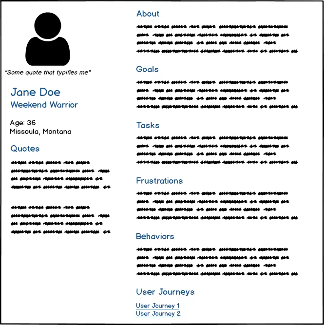
A UX Persona is a general representation of one type of user or target user for a system. They should contain relevant characteristics, tasks they need to perform, and goals or needs they are trying to meet. Personas help keep the design and development process user-centered by reminding teams who they are creating the product for.
By providing an easily shared vision for each user archetype, personas serve to remind product teams of who they are designing for. Is your user familiar with your other applications? Are they even familiar with applications or design standards you are modeling your product after? Are the features you are about to spend several sprints on addressing the top needs of the user?
They also work well to share key insights gained from performing user research to the rest of the organization. Although UX researchers may start with a Proto-Persona (a hypothesis), they should end with a user model based on research.
Personas are probably the most controversial deliverable on this list among product creators. There are many advantages to user personas, keys to successfully using them, and pitfalls to avoid. We will cover them in more depth in a later post.
Related:
User Scenarios
User scenarios are brief stories about a persona that focuses on users’ goals and tasks. They are often built on top of an Agile User Story by adding interactions the persona is going to have with the product or service and the context the interaction takes place. These can describe workflows that are happening before your solution, with your solution, or with another tool. User scenarios are often discovered by the product owner or someone doing user research.
Like personas, user scenarios remind the product team what problems they need to be solving and to keep the focus on the core values being delivered. They can also highlight potential usability or technical challenges. For example: “An on-call IT Admin heads to work after getting an emergency alert from Service X. While driving, they need to know if the emergency’s been canceled so they can turn around and go back home.” From this scenario, the team may realize they need a way to notify the user of a canceled emergency that won’t distract them while driving. The user needs to be alerted, but they also need to know if they can return home to avoid driving all the way to work. The second need may get missed in a typical ticket of work without any thought to the scenarios the application is being used in.
Empathy Map
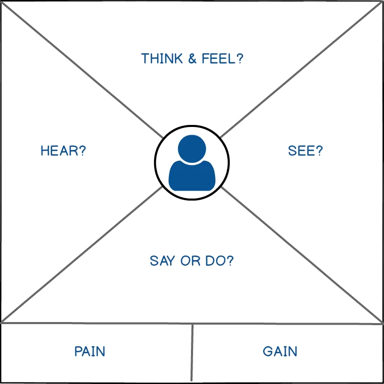
The empathy map is a deliverable that helps increase empathy with your user by sharing user needs and behaviors gathered from qualitative research. It works really well as a way to find out what the team knows about a user segment and where there needs to be more research. Empathy maps can be created collaboratively with a team early in a project and should be kept up to date throughout as you find out more. In the case of an individual user, a map can be made to help gain insights from a user interview. Several individual maps can be used to help define a persona.
The classic format of an empathy map is to have four sections (Says, Thinks, Does, Feels) in a quadrant around a user persona. Although there is a newer version updated by the empathy map creator, Dave Gray.
- Says – Direct quotes from users during studies about their experience.
- Thinks – What a user is thinking during their experience. What “think out loud” comments did they make in a usability test.
- Does – What are the actions a user is actually taking to perform the task?
- Feels – Try to capture the user’s emotional state and the context it happens in. “Frustrated – clearing an email pop-up when filling out the form”
Discover the holistic experience of the user and get alignment from the organization
Affinity Map
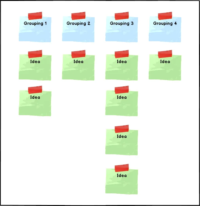
Affinity diagrams, also known as affinity maps and based on KJ (Kawakita Jiro) diagramming, are a design thinking method to group observations and insights from user research, ideas from design sessions, or ideas from UX strategy sessions. While allowing the team to use their experience, creativity, and intuition affinity maps make potentially large amounts of data more meaningful.
While affinity maps are useful for individuals, they really shine when sharing insights and ideas with stakeholders and a team. By starting with a mass of insights and collaboratively clustering them into topics and sub-topics, you’ll get greater stakeholder engagement than from sharing research reports.
Typical high-level steps for a mapping session are:
- Team members write down ideas and insights on sticky notes (or a digital version) during usability tests, brainstorming, etc.
- In a mapping session, all the individual stickies are laid out for the team and anyone else to see.
- The stickies are then grouped and ordered by priority under categories by the team as a whole.
Categories can be pre-determined beforehand to get things started with the flexibility of adding more during the mapping session.
Related:
- An Affinity Diagram: Strengths, Weaknesses, and Steps to Creating
- Affinity Maps versus Card Sorting: What the Difference is and How to Use Them
- Organizing UX with Affinity Diagrams
User Journey Map
A user journey map is a diagram showing the visible and invisible steps a user goes through when trying to accomplish a goal with a specific service. Also referred to as a customer journey map, especially by marketers who also often use this type of map. In the enterprise world, the customer and the user of a system may be two different roles so we prefer User Journey Map when thinking of UX. Journey maps are helpful to the UX designer to demonstrate what users’ needs, goals, and motivations are at each stage. “User” can be in general or a specific persona.
Related:
- Why Are Journey Maps Important?
- Journey Mapping: What Components To Include?
- The Nitty Gritty of User Journey Maps
- What are the Customer Journey Stages?
Experience Map
An experience map is a representation of all the complete(end to end) routes customers take to reach a specific goal. This can be product agnostic or include the product or service. The experience map shows the questions, the answers, the paths, the emotions, behaviors, and feelings. Using sticky notes or on a whiteboard, they can be huge, over 4 feet wide showing every possible path to get from start to finish.
An experience map is just that, a map of the experience. The goal of the experience does not need to have anything to do with a product.
Related:
Cognitive Map (Mind Map/Concept Map/Mental Model Map)
A powerful tool, a cognitive map helps user researchers understand how users think about concepts, workflows, or problems. There are no formal rules for how one is designed but can have many nodes and relationships.
A cognitive map is also an umbrella term containing concept, mental model, and mind maps. All are for visually describing the mental model of users, the team, or an organization. All three are very useful during the discovery phase of a project when gathering qualitative data. While cognitive and mental model maps are often depicting how the user organizes and think about a process, concept maps are used by the UX designer to model a process based on what was learned from research.
Related:
- Concept Maps: The Art of Making Relationships
- Mental Models vs Conceptual Models for UX Design - What is the Difference, When to Use Which?
Mind Map
A mind map is a more general visual thinking tool used by many to help expand concepts and thoughts around a single topic. Mind maps are useful as an exercise both to guide a user through to discover their mental model or for the UX designer/engineer to organize ideas when starting any project or tackling a tough challenge.
Concept Map
A concept map is a graph of concepts and relationships for a user or group of users. Concept maps focus on the relationships between several topics and may have complex parent-child mappings. Just like other graphs, the relationships are edges that are directed (usually unidirectional). In a mind map, each node will only have a single parent, but in concept maps, a node may have multiple parents.
Mental Model Map
Mental model maps or diagrams focus on a task-based user segment. A Mental model map identifies the beliefs, behaviors, and emotions while the user is completing the task. They help to describe how the user defines steps around a task, and how it differs from your definition or the “industry standard” definition.
Related:
Impact Map
An impact map visualizes the relationship of a business goal to the impact or outcome it has on a user. An important part of UX is connecting business goals with user needs, and impact mapping helps visualize those connections. They are simple enough to do during strategy meetings with business stakeholders and technical architects. An impact map is typically made up of a single business goal node that is mapped to a set of actors, then to the impacts on each actor, and then to the deliverables creating the impacts.
Service Blueprint
A service blueprint visualizes the user experience across different service components of an organization. Those “components” can be products, people, processes, physical locations, and more. Service blueprints are an integral part of service design and UX strategy. They may be the most important tool for the UX strategist because they raise UX out of the singular feature focus up to across a whole product or organization focus. These are one of our favorites during the discovery phase with our clients because it quickly exposes problems for customers and members of the organization.
A service blueprint is typically broken down into four swimlanes: User/Customer Actions, Frontstage Actions (user-visible), Backstage Actions (internal), and Support Processes. Service blueprints are usually chronological by time or stages for the user. User stages do not have to be linear though, for instance, a stage where the user is a repeat customer would be cyclical as they make multiple purchases over time.
Related:
- What Are the Components of a Service Blueprint?
- Service Blueprinting: Best Practices, Tips, and Tricks
- 16 Benefits of Service Design & Creating a Blueprint
- 13 Cognitive Biases that Impact Your Service Blueprint
- Service Blueprint for a Restaurant
What are the problems, challenges, and current state for the user?
Usability Report
A usability report is a “plain English” report of usability testing results for an organization’s internal stakeholders. This is one of the most common UX deliverables a UX research consultant will provide early in a project. However, this is also a deliverable in-house UX professionals doing usability research should be sharing. UX research is near useless if insights are not being shared with product teams and decision-makers.
Usability testing reports can vary a lot and follow different formats. In general, you should:
- Keep the report as short as possible for your intended audience. If you need to be more in-depth for different audiences, create a full version and a summary version.
- Use plain, simple language for your audience. The report needs to be usable, if it takes a stakeholder hours to consume and understand the report, they probably won’t read it.
- Use sections to break up key areas and keep sections clear.
- Use visuals like graphs and tables to share metrics, lean towards metric summaries like percentages instead of raw data.
- Provide screenshots of the user interface that was tested. This is helpful for your audience, but also as a reference for the UX team later after the UI has changed.
- Usability reports are to inform decision-makers, not share opinions or promote agendas. Keep the reports as unbiased as possible, just present the facts and honest recommendations. Include data that may contradict your recommendations.
Some common sections to include are:
- Summary – what was tested, when was it tested, how it was tested, who did the testing, and briefly what the results were.
- Methodology used – provide stakeholders and your future self a track record of how the results were attained.
- Results of the test – Deeper dive into the results of testing the interface/product.
- Findings and/or Recommendations – provide your conclusions backed by the data in the results. These could be recommended actions, but can also be for further research when something is a priority but data was inconclusive.
Heuristic Analysis Report
A heuristic analysis report is the UX artifact from performing a heuristic evaluation or expert review. A heuristic evaluation is a method that should ideally be used throughout a project by more than the UX team. Designers, QA engineers, and front-end engineers should all keep usability heuristics in mind whenever they are creating a UI.
Heuristic analysis is a quick tool that can provide quick feedback throughout product design and development. An expert review can be more challenging since true UX experts with wide product experience are a form of unobtainium. However, getting at least semi-independent expert reviews can find usability issues early. An expert can be an unbiased UX expert from outside of the product team, not necessarily a consultant.
From our experience, expert reviews and heuristic analysis find lots of smaller usability problems. Without doing user testing, bigger problems may not be discovered, especially by outside consultants not familiar with the problem space. The advantage we’ve found is that often the problems found are easy to fix over a few sprints of work.
The heuristic analysis report should follow and include Nielson’s Heuristics for Usability:
- Visibility of system status
- Match between system and the real world
- User control and freedom
- Consistency and standards
- Error prevention
- Recognition rather than recall
- Flexibility and efficiency of use
- Aesthetic and minimalist design
- Help users recognize, diagnose, and recover from errors
- Help and documentation
Accessibility Analysis
An accessibility analysis is similar to the heuristic and usability report but focused on accessibility issues by an expert. Accessibility analysis should be done for any new feature release, but often is sadly only done for a whole product at the last minute. Besides being the ethical thing to do and is necessary for ethical design, accessibility affects a wide variety of users and will impact business goals. If not planned for in product development early on, it can limit where the company does business and who they do business with.
Accessibility analysis is a big topic, and we’ll include a fuller guide in the future, but WebAIM is a good resource for information and tools. Here is some low hanging fruit we always watch for:
- Semantic markup that is screen reader compatible.
- Color contrast, especially for text and interactive elements. Designers, your light/medium gray text on a light background isn’t accessible, stop using it!
- Do interactive elements only use color to signify they are interactive? For example, links without underlines need some other signifier other than color to show they are links.
- Hit zones around interactive elements need to be big enough for touch and users with coordination challenges.
- Do all images have ALT text descriptions?
- Do mobile applications work with built-in OS accessibility tools?
Content Audit
The content is often overlooked by UX professionals with a design or development background. Content strategy is an extremely important aspect of the user experience. Not just on the company blog or marketing landing pages either! Headers, menu and button labels and content across all channels and products affect UX and should be part of your content strategy.
The content audit report covers all channels and UIs the persona in question is exposed to. The content audit provides issues and recommendations for improvement with content readability, strategy, and consistency. The audit report should also include the quantitative performance of content areas and labels. Example research questions can be:
- What are the top-performing pages with segment X?
- Which pages have the highest bounce rate?
- Which behavior flows have pogo-sticking behavior?
- What are users entering in the search, either in external or internal search? Are they searching for the content you thought was easy to find?
Content audits can overlap with usability tests or include results from usability tests as well. Common overlaps with usability are readability scoring, terminology (complex jargon), navigation and button labels, and labels for the taxonomy of your content.
Information Architecture Diagram
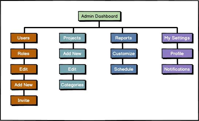
Information architecture (IA) is commonly confused with navigation. However, information architecture is not part of the UI, it informs the UI design. An IA diagram visualizes the structure, organization, and terminology of the application or website. Although IA may not be visible to the user, it will drastically affect the user experience. How content is interconnected and organized affects usage, findability, and navigation for the user at the minimum.
Think about IMDB.com, if they didn’t relate directors to movies in an IA hierarchy, how easy would it be for a user to discover new projects of their favorite director?
The information architecture diagram looks very similar to a web sitemap, but not all items in an IA diagram would appear in the UI or navigation of a site. The diagram can contain all existing content, grouping of information, taxonomy, and relationships between data. The taxonomy can inform label consistency and correct terminology for your user base, the grouping may help design the navigation, and relationships may be used as meta linking to interconnect content later.
Content Taxonomy
Defining the taxonomy of content for a platform is an undervalued resource for product teams. Not just for agencies and consultants who aren’t industry experts, but for product teams that are in B2B industries with highly specialized knowledge. For example in fin-tech or healthcare. Having a defined content taxonomy can help with new developers and designer training. Taxonomy descriptions act as references during design sessions for labels and content going into the application.
An example from our experience is POV in emergency healthcare. POV for techies means “point of view” but in healthcare, it’s “personal owned vehicle”. Healthcare professionals in general use many acronyms and technical terms that would normally confound the average user of a system. If you didn’t use those terms in an application for clinicians or classified content for a casual user you would be decreasing the usability by using the improper taxonomy.
User Research Reports
The user research report is exactly what it sounds like, it covers insights gained from studying your current and potential users. The user research report includes data from quantitative and qualitative research. Unlike the usability report which is testing an interface, the user research report is all about your users. Who they are, what are they trying to do, what goals and needs do they have, what pain points and frustrations do they have.
This report can happen at any phase of a project. You may want to do research on a competitor’s users (way better than analyzing the competitor themselves), how users perform tasks currently without a tech solution, or on your existing products.
The user research report should include:
- The research hypothesis, what’s the point of research?
- Summary of methods used.
- Supporting data, if there’s no data then it’s not research.
- Qualitative examples along with metrics. Is there a quote that highlights an overall problem?
- Insights supported by the data. Insights make these reports usable for stakeholders and give them actionable points from the research.
Surveys
Surveys are an extremely flexible tool for getting a range of feedback and research data from users. Although prep time for an effective survey usually takes longer than people expect, surveys are still a very quick and cheap research tool. They can be run on a regular basis, for special projects, or automated based on set conditions. Well written UX surveys can gather both quantitative and qualitative data from a large number of users.
Too often organizations rely on unprompted feedback from users, like support requests or reviews. Which are heavily weighted to the extremes of experience. Surveys allow you to prompt for feedback from users who have a full spectrum of experience and feedback. Not just when they’re really happy or unhappy with a service. UX surveys enable you to target user segments that may be underserved or have specific experiences you need to know about. For example, users from a specific type of department or job function. You simply will not get as good of quality of data from unprompted feedback.
Quantitative questions capture measurable answers that can have statistical analysis applied to them. They often focus on the what of a user’s behavior. Some examples of quantitative questions are:
- I thought the system was easy to use: 1 (Strongly Disagree) – 5 (Strongly Agree)
- How many times have you run a marathon?
- What was your favorite marathon?
Qualitative questions focus on the why of a user’s behavior. Just like interview questions, qualitative survey questions should be open-ended and use terms like describe, how, and explain. Examples of qualitative questions are:
- Explain your experience with your favorite marathon…
- Why did you prefer that race?
- Describe the steps you take when signing up for a marathon…
Examples of some survey types for user experience data are:
- A regular survey sent to different user segments asking open-ended feedback.
- A triggered survey based on interaction with a service of the organization to get timely feedback on a particular experience. (Whether good or bad)
- A SUS (System Usability Scale) survey about one of your applications.
- A short web form with 1 or 2 questions to determine user goals at that point.
Experience Analytic Reports
UX focused analytics can be challenging to learn about because they often get buried under the mounds of marketing focused analytics information available. However, even marketing-focused analytics tools like Google Analytics can be used to gather experience focused analytics. For UX we want to focus on metrics and reports about what the user is doing in our application
Below are example reports in Google Analytics you can use from marketing analytics for tracking UX indicators.
- Audience Technologies Reports: Under Audience -> Technology -> Browser & OS, Audience -> Mobile -> Overview. Don’t just assume that your users follow some generic stats about device usage. Verify with your actual users. In healthcare, we’ve seen over 66% iOS usage and 70% Windows 7/IE 11 usage in 2019. Remember, IE 11 is supported until Windows 10 hits End-of-Life.
- Behavior Flow Report: Under Behavior -> Behavior Flow. This report shows the navigation steps a user takes from a starting point like a landing page or campaign throughout your site.
- Event Reports: Several under Behavior -> Events. Events are the most powerful part of any analytics platform. In Google Analytics you can send custom events from your application/prototype/site code or set up many events in Google Tag Manager. Events can track timings, like form completion, amount of video played, or other tasks. They can call out when a user takes an important action, like clicking the checkout button.
- Site Search: What terms are users searching for on a website? This can be an important indicator if you are missing something from your navigation, or have a confusing label. Setting up your site for Google Search Console and tracking your search on your site is a bigger topic we’ll cover in another article.
- Goals Reports: Several under Conversion -> Goals. Goals allow you to highlight specific user behavior and provide them with a value/score. Goals can go hand-in-hand with events or when a user reaches a specific view or URL in your application. We often use goals to track our UX KPIs for a project.
Testing and validating solutions
Value Proposition
This is not so much a deliverable as it is a service you should offer to clients or your company. What is the value being created for the user by doing X? If there is no value, that feature, text, button, research is a waste of time and money. Save it for a hackathon or personal project. Even if the work has business value, if there’s no user value likely the business goal won’t be met either.
By keeping the value proposition in mind you and your teams will prioritize work that delivers the most impact for your users.
Storyboards
Storyboards are a set of linear sketches with a narrative that shows and tells the user journey during an experience. The storyboarding process is powerful for teams to be able to generate ideas and critique what is known about the user journey. A great storyboard ties together a character (persona), scene (context), and plot (user stages).
Where storyboards really shine is getting engagement and feedback from your own organization. Sketches are quick to comprehend and express ideas, although you should keep the number of panels low and concise. The proposed user journey in storyboard form can be understood at a glance for busy stakeholders and give you feedback early.
Task Analysis
Task analysis is observing someone performing a task while meeting their goals. This might be a current user or someone who represents a target user type. The resulting analysis defines the steps that an application or a feature may need to support for your users. I say “may” need because this is also how you identify manual steps that could be automated or skipped in the application to provide more value for the user.
Task analysis should be done before prototyping and design since it should inform the design of any workflows. Too often task analysis is skipped because stakeholders believe in the “idealized” task flow they are proposing, but usually, this is a mistake. Even if an optimized workflow is more ideal, you still need to know how to communicate that to your users who have specific mental models and habits.
UX Flow Diagram
UX flow diagrams detail the steps a user takes to accomplish a task. There are different types of flow diagrams that have different levels of detail into the user steps. Task flow, user flow, and wireframe diagrams are all UX flow diagrams and help teams align on the steps a user will take to reach their goals. They are very useful to create before doing any prototyping because they define what actions the prototype should be built to test.
Task Flow
Task flows are the lowest fidelity diagram, so they can be the quickest to iterate on. A task flow shows the steps all users have to take to accomplish a single task. For example, creating a new account, adding a payment method, or uploading an image.
Depending on the level of detail you need to show, there are two common styles of task flow:
Linear: You only show the tasks as a smooth procession from step to step without any alternate decisions.

Branching: You show the possible decisions for each step and the results of each decision. This looks like the typical flowchart.
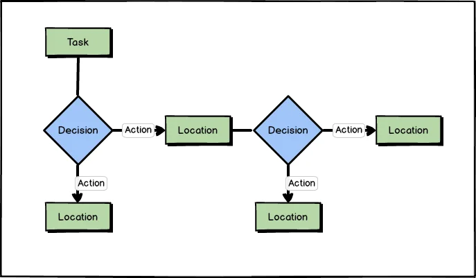
Because task flows are so fast to create, we have found them to be an excellent team collaboration exercise. Working through task flows helps build understanding and alignment in your team before any UI or development work is started. At the very least these should be done with stakeholders near the beginning of a project.
User Flow
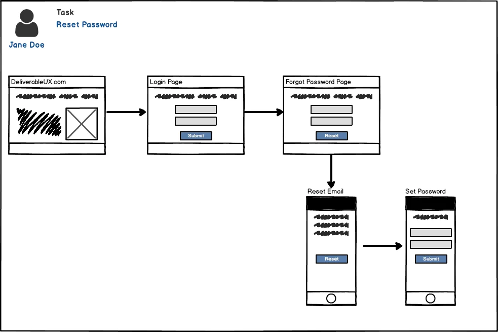
A user flow diagram follows the steps a single user type takes through your application. Unlike task flows which are for all users, a user flow focuses on a single persona performing a task. Think of them as a purely visual user journey and can also be terrific at understanding and sharing the user’s experience.
Wireframe Diagram
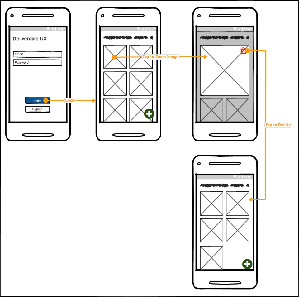
Wireframe diagrams use basic wireframes that are connected by the steps a user may take to accomplish a task. Also coined as wireflows by NNG.
A wireframe diagram is excellent for all types of applications (web, desktop, mobile) and increases the benefits of wireframing for more complex flows. They can lead stakeholders through the visual layout, interactive components, and the state changes caused by user actions for complex applications. We have often used wireframe diagrams to show the UI and flow for specific user stories attached to a unit of work. They act as a visual story, specification, and atomic design guide all at once.

Wireframes, Mockups, & Prototypes
Each one of these is a major deliverable for any UX professional on the design/implementation side. As a UX’er coming from a software engineering and usability background, these are the #1 deliverable I’ve been asked to produce. I’m not saying they are the most important, but that this is often what stakeholders think of when they hear “UX”.
I grouped them together because there can be a lot of overlap and blending of the three. For instance, you can have “sketchy” low-fi wireframes inside of a prototyping tool like Axure or Adobe XD that shows advanced interactions or design mockups on hardware that aren’t interactive. Each tool or combination should be evaluated by the questions it will raise and scenarios it will test. There are benefits to each tool, it really comes down to what questions you need answered, how you need to test a solution, risk of not testing something, and time allowed. I find that each one, even for the same solution, will raise different questions from stakeholders.
Low-fidelity Methods (fastest iterations)
- Concept Sketches: Napkins, paper, whiteboard, or digital, whatever your easiest medium to brainstorm in, here it is. Concept sketches are an important part of solving problems and thinking outside of the lines (pun intended). Not always something I would deliver to stakeholders, but often done as part of a session with them. Details are not important, getting your thoughts down and sharing them is the goal.
- Wireframes: More filled out than a sketch, but still very fast to produce. Wireframes get stakeholders to focus on concepts, layouts, and approaches to a problem. They help avoid getting bogged down in design considerations like color choice or branding and focus on the problem being solved. At their simplest they are still non-interactive, so best used when you can walk stakeholders through them.
- Design Comps or Design Mockups: These are usually non-interactive, and show the full-fledged design of the UI. Although these are non-interactive, hence low-fidelity, they can be used in a prototype for a very polished experience. This is where you get to bring up design and branding choices. Of course, you can test out layouts with design comps, but beware that it can be hard to get past style discussions with stakeholders.
High-fidelity Methods (slowest iterations)
- Interactive Prototypes: These are UIs that show the state transitions and interactions of the solution. A user or stakeholder can click or touch them and possibly complete tasks. A prototype is great for usability or concept testing. If your tool or skillset allows, this is the best place to test micro-interactions like transitional animations. You can even gather quantitative data from prototypes. The key reason a prototype is useful over just producing the application is that only the UI or interactions are the focus. Data, business logic, code quality don’t matter in a prototype, so validation and iteration is faster.
- Client UIs with mocked backends: These are often overlooked with newer UX Designers as more come from a design background and the availability of more tool options for prototyping are available. Here you work with the actual medium your solution is going to be in, like JavaScript/HTML, Android Studio, etc. Again, you largely focus on the UI interactions but you can test additional solutions that are difficult with a prototyping tool. You don’t care about the robustness of any backend service, but you can test things like notifications, multi-user interactions, or solution feasibility with simple services. For example, using the Google Sheets API as mock data storage, or Twilio for SMS. The other big advantage of this is you avoid a common designer mistake, proposing a solution that isn’t feasible in the application platform. The big disadvantage is the high-risk of prototype code making it into production to save time and money. This seems like an easy mistake not to make, but I’ve seen it happen multiple times at otherwise savvy tech companies to save money in the short-term.
Mixed-fidelity Methods
These methods are really just examples of how you can take the above tools and recombine them to best validate/invalidate your proposed solutions.
Linked Wireframes/Design Comps
- Balsamiq, which produces “sketchy” wireframes, can add links between wireframes. You can produce a PDF that can be loaded onto a smartphone or desktop that is clickable for a walkthrough wireframe/prototype.
- Beautiful design comps answer a lot of questions but aren’t great for portraying a user story. However, by putting them into a web tool that can do image maps you can make any part of the design clickable. These also can work on the hardware of your choice (phones, tablets, desktops, etc.). Anything with a browser.
** Interactive Wireframes**
- When I want to thoroughly test a solution, view states, and interactions, this is my method of choice. These are wireframe-like UIs that are either in HTML/JavaScript or a prototyping tool. I like interactive wireframes because they bypass visual design preferences with stakeholders and get them to focus on the solution. They are also easier to do unmoderated testing with versus non-interactive wireframes or design mocks.
- If you are an HTML/JavaScript maestro find (or make) a gray-scale or sketch Bootstrap theme and voila! You have a toolset that can produce mobile/desktop/kiosk/TV prototypes quickly.
Microinteraction Prototype
- Microinteractions are important and shouldn’t be overlooked. Often though a designer has something in mind and the developer has something else in mind during the handoff of static assets. For new microinteractions, doing a simple prototype that demonstrates just the microinteraction will save you and the developer time in miscommunication. Examples are showing the view state sliding left when a button is pressed, a thumbnail “expanding” to fill the screen when pressed, or a notification showing after a specific action.
- Prototypes don’t have to be very complex or show every interaction, they should do just enough to demonstrate or test a specific concept.
Design Language System
What is a design language system and why is it important? Design systems vs. pattern libraries vs. style guides, what’s the difference? These are often confused with each other, but they are actually different UX deliverables. All of those are part of an organization’s design language. A design language system, or simply “design system” is made up of pattern libraries and style guides. It’s a much more useful asset than a brand guide which is often just marketing speak for a style guide and doesn’t tend to serve your users.
Apple’s Human Interface Guidelines, Microsoft’s Fluent, and Google’s Material are all design languages. They do include style guides, but mainly pattern libraries for components, and best practices for usability across multiple mediums. You don’t have to produce a system that is as thorough as these for your team, but they give you an idea of what you should be including beyond what colors to use. At the minimum, your design language should include a basic style guide (color use, font use), pattern library with sample components per platform being developed for, and any guidelines for elements that must be consistent.
Design systems are important for organizations with medium to large teams, or with designers/developers spread across platforms. Your design language provides a guide that removes the guesswork for developers, a framework for new features, and consistency for your users. Without a shared language your interfaces will not communicate what you intend to users. References and Further Reading
“Mapping Experiences” by Jim Kalbach
“Universal Methods of Design” by Bruce Hanington; Bella Martin
